Branding & Identity, Packaging, Photography
Aahana Organics
The Story
A Denver-based Ayurveda skincare and wellness brand. Built on a consultation model, the founder Joy Luria formulates custom solutions for each client’s needs. Made in small batches, every product is organic, natural, vegan, food grade, allergen, gluten and preservative free.
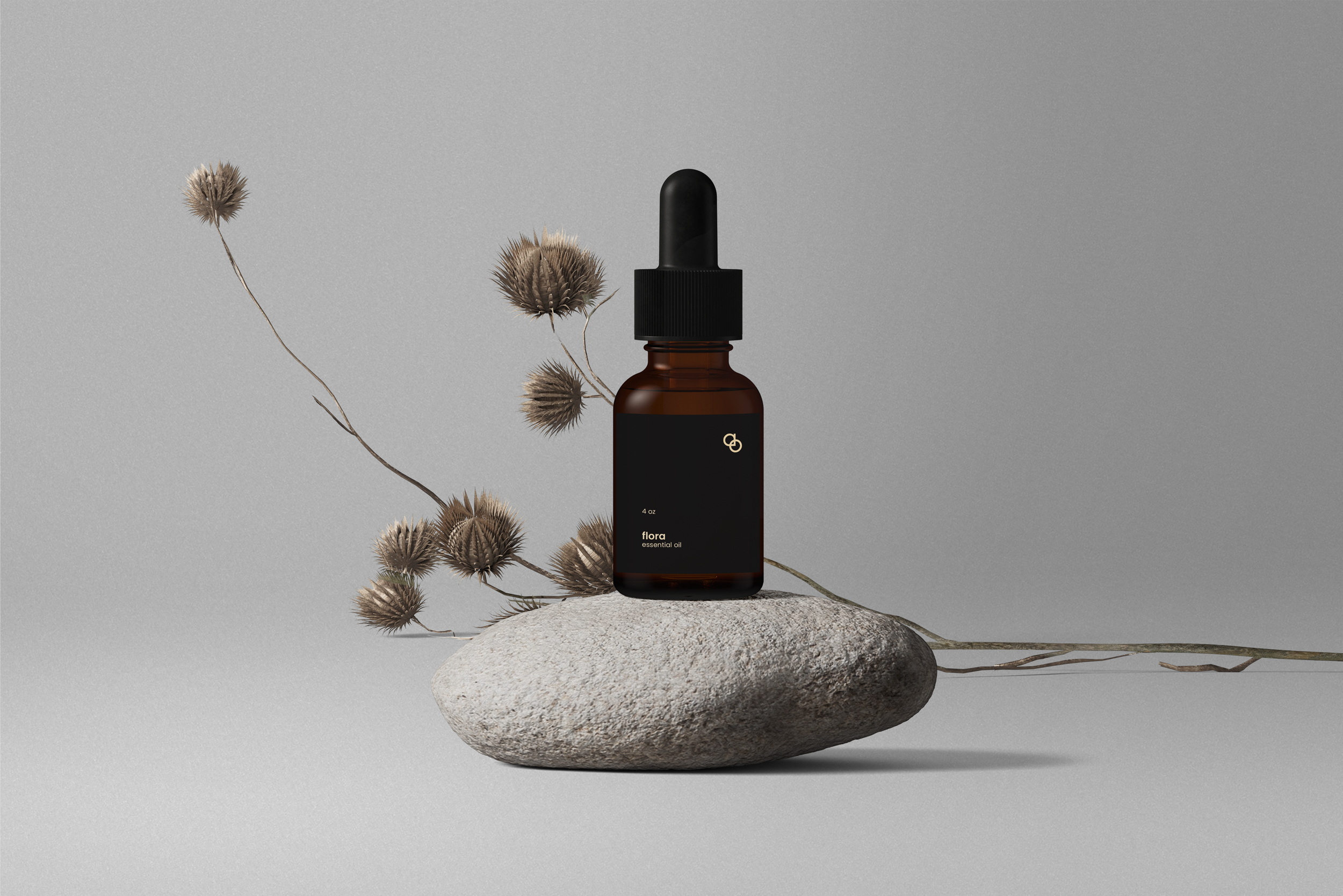
We worked together to rebrand her identity, transitioning from its cluttered past to a bespoke Ayurveda - centric identity. This minimal design language was also extended to the brand’s packaging and augmented by ingredient and product focused photo shoot in Texas.
Colors & iconography
Calming, earthy colors - natural, elegant and inspired by the five elements of Ayurveda – aether, air, fire, water and earth.
Extending the color story to the symbols to distinguish each element. Experimenting with using the same ‘drop’ silhouette to create all the subsequent brand icons.
aether
air
fire
water
earth
Photography & mehndi art
Saturated, nature oriented photographs aim to keep the brand’s conscious products and organic ingredients in mind. They were shot deep in the heart of the American forestland. Both the creative direction and photography echo the brand identity.
Using mehndi (henna), a traditional form of Indian body art, to channel the elemental symbols. The hands are a nod to the handmade nature of the products, each hand belongs to a different generation, true to the brand’s diverse clientele.
The Campaign Shoot
The Mehendi Series
Impact
A refreshing new identity revived the brand’s presence and saw a renewed interest from her regular clientele.


