Branding, Illustration, Packaging, Photography
Gavya ghee
The Story
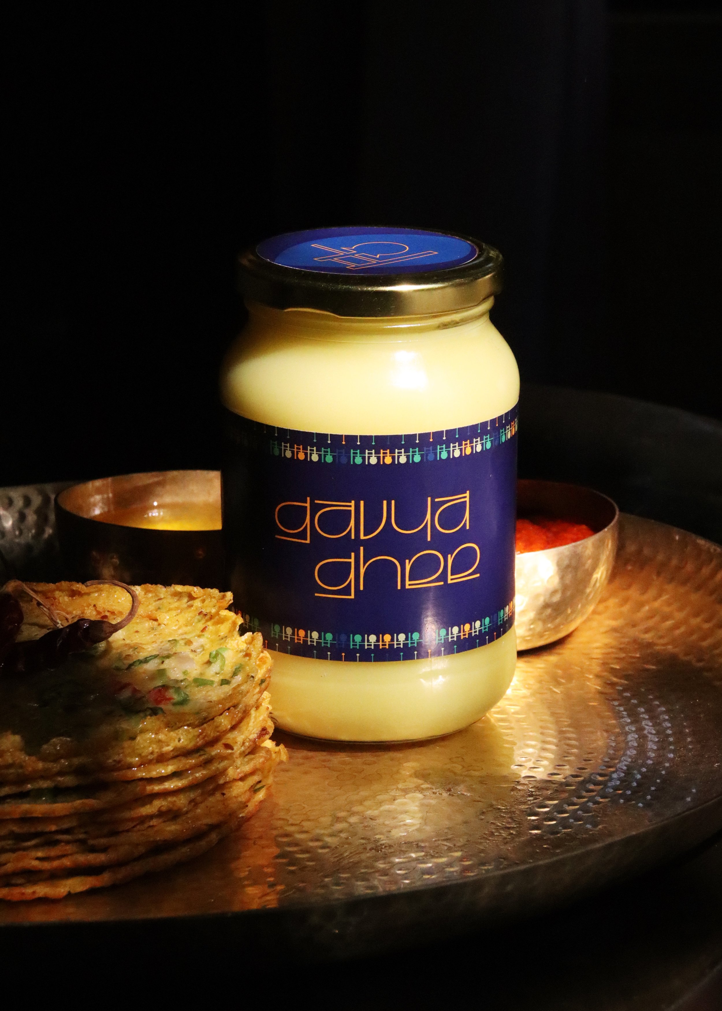
Ghee (clarified butter) made from the fabled Gir (Gujarat, India) cows’ milk. Of pure A2 quality and hand churned in the traditional bilona method, this homegrown Indian brand is carving out a niche for itself with its all-natural farm-forward approach. The brand identity aims to be fresh and bold, a pop of colour amongst the monotony of competitors, drawing on elements of its cultural roots.
The product and process photoshoot gives consumers an intimate understanding of farm life.
A modern sans serif with an Indian twist.
The primary ghee yellow pairs with hues of natural greens and blues.
The geometric bilona apparatus motif recurs across the brand communication and packaging.
A2 milk collected daily, churned by hand in a bilona and slow-cooked in earthenware – fresh from the farm to your plate.
The bilona churning method is lengthy one, done by hand from start to finish. It felt natural that the brand visuals be derived from the distinctive silhouette of the clay pot, rope and churner. From the border details on the label to the stickers, the origins of this ghee are never forgotten. They serve to remind each customer of just how fresh and sustainable their very own jar is.
Impact
Gavya Ghee now ships nationwide.


